Measurand Histogram
Analytics has been added into myQAP, allowing for in-depth and real-time comparison of results.
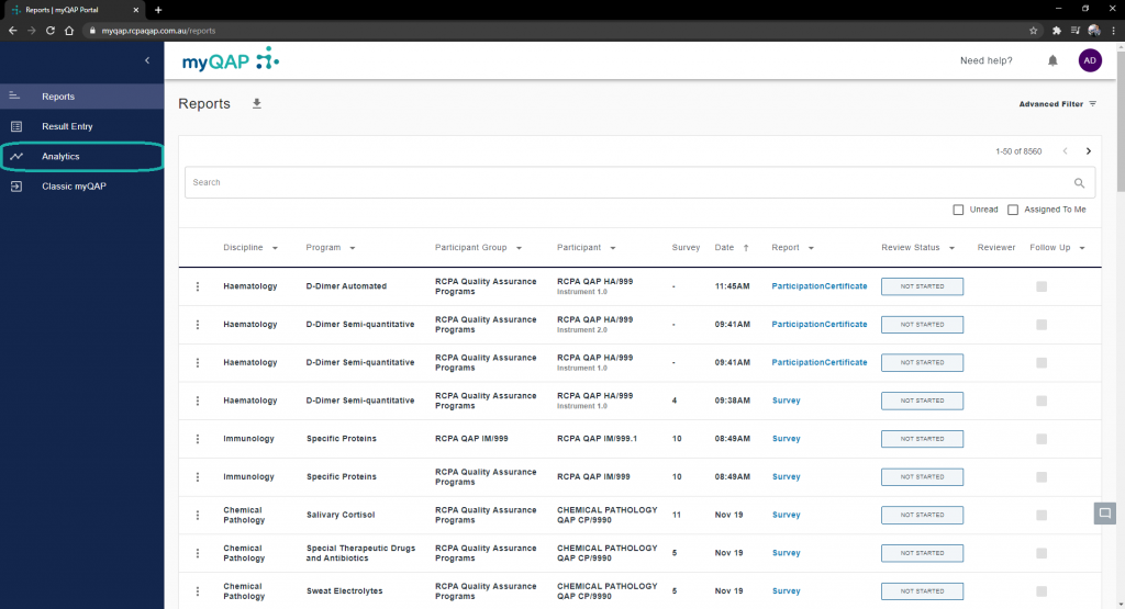
Select analytics from the side menu
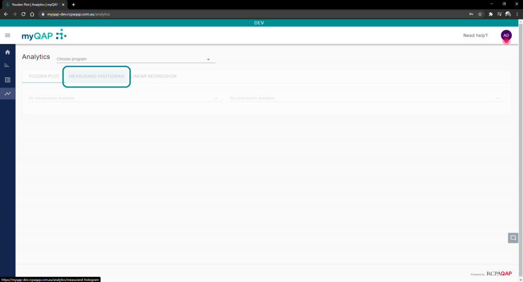
By default you will land on the Youden plot tab. Select the tab labelled, “Measurand Histogram”.
Select Program, Measurand, and Participant
Using the drop-down menus highlighted in the image below, select the program, measurand, and participant you wish to analyse further. All programs you are enrolled in and all participants you are a contact for, will appear in these lists.
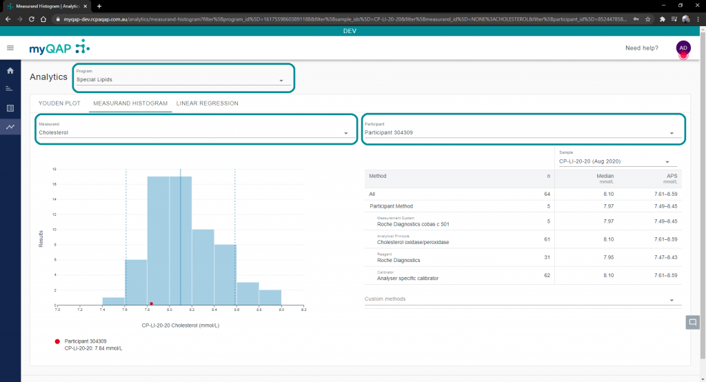
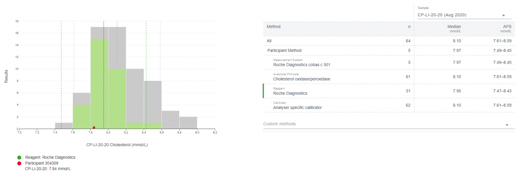
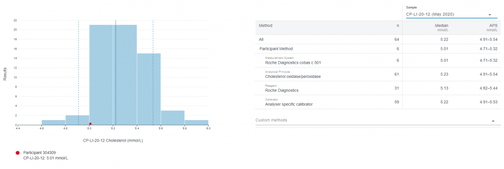
The dotted blue line on the histogram represents the APS, the solid blue line the Median, and the red dot represents the selected participant’s results for that sample.
Method comparison
Selecting any of the options from the participant method list will highlight the chosen selection on the Histogram in green. It will also shift the APS and Median lines to reflect the chosen selection.
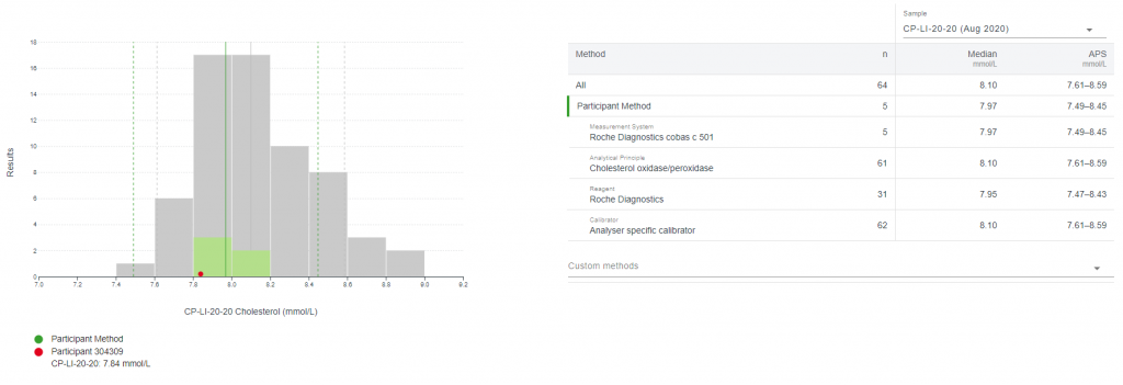
Custom method selections
Using the custom method drop-down menu, you can choose to analyse results against any method option.
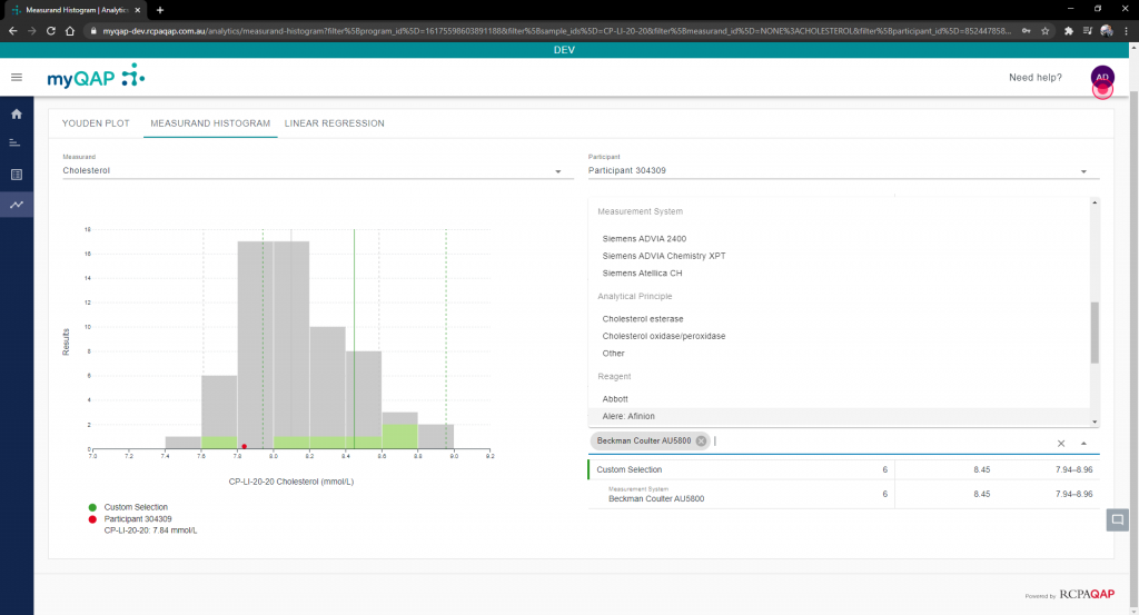
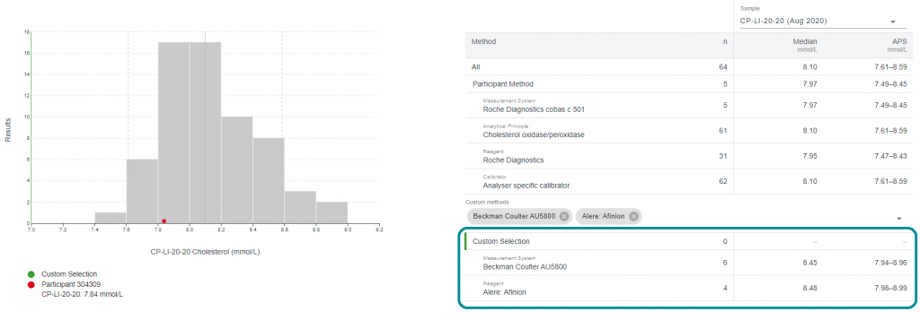
Once again you will notice the shifting of APS and Median lines.
Please note that if your chosen combination has no returned results, you will have to go through each of your selections individually, or alternatively pick a different combination.
Change sample
Located above the participant method field is the sample selection drop-down menu. Using this will allow you to choose any sample currently available as a base of comparison.
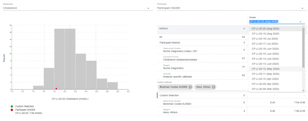
Doing so will change the Histogram, APS and Median lines, and your participant’s returned result, accordingly.
Use the Youden Plot and Linear Regression functions
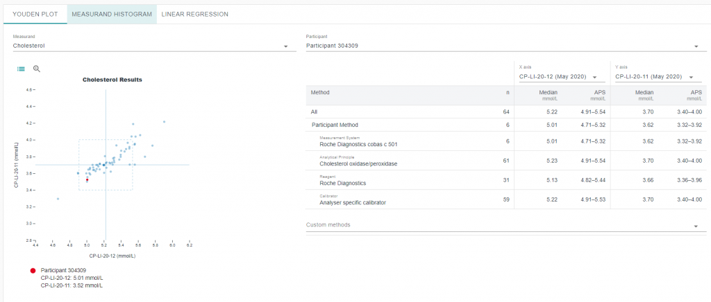
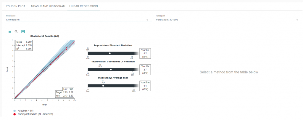
Clicking either of the Youden Plot or Linear Regression tabs will move you to that part of the analytics functionality. Both of these work fairly similarly to the Histogram section, but there are separate help articles for these functions to further explain how to use them.
Can't find what you're looking for?

