Youden Plot
Analytics has been added into myQAP, allowing for in-depth and real-time comparison of results.
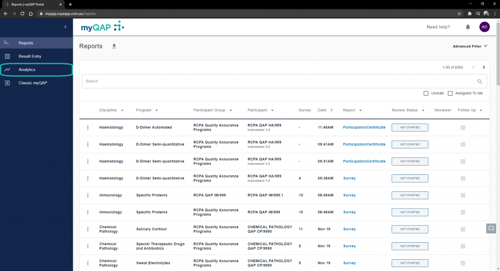
Select analytics from the side menu
Choose your program
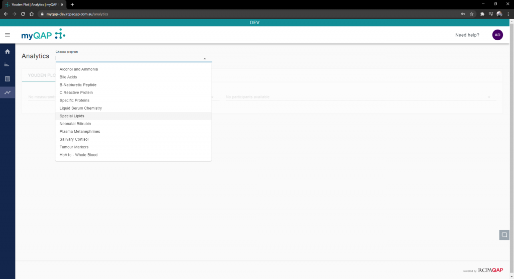
All programs you are enrolled in will appear in this list.*
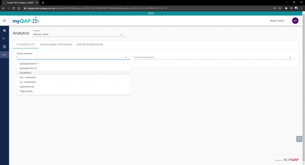
Select the measurand to analyse
After this step, the Youden plot will display. No results or methods will be highlighted at this stage.
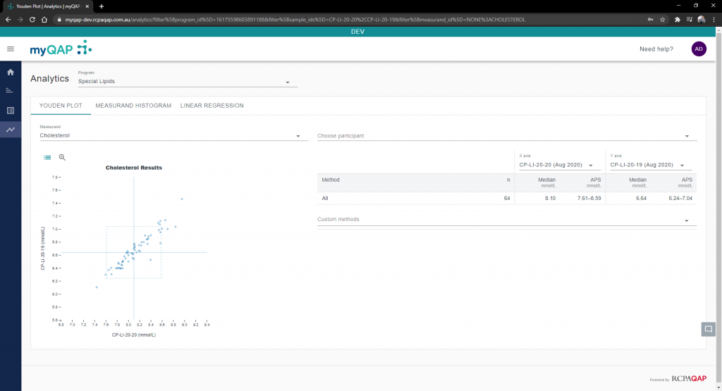
By default, samples from the latest survey round are populated in the axes fields.
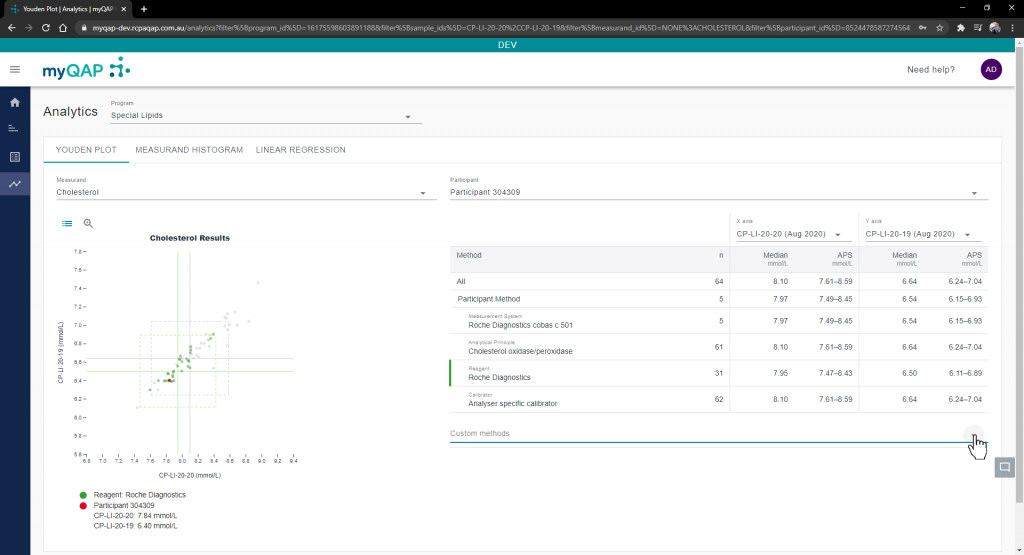
Pick a participant
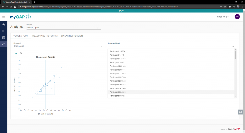
Any participant you are a contact for will appear in this drop-down menu.
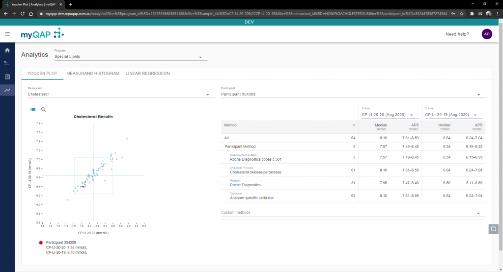
Notice that the method fields are now filled with the chosen participant’s method selections, as well as the result being highlighted with a red dot on the the Youden plot.
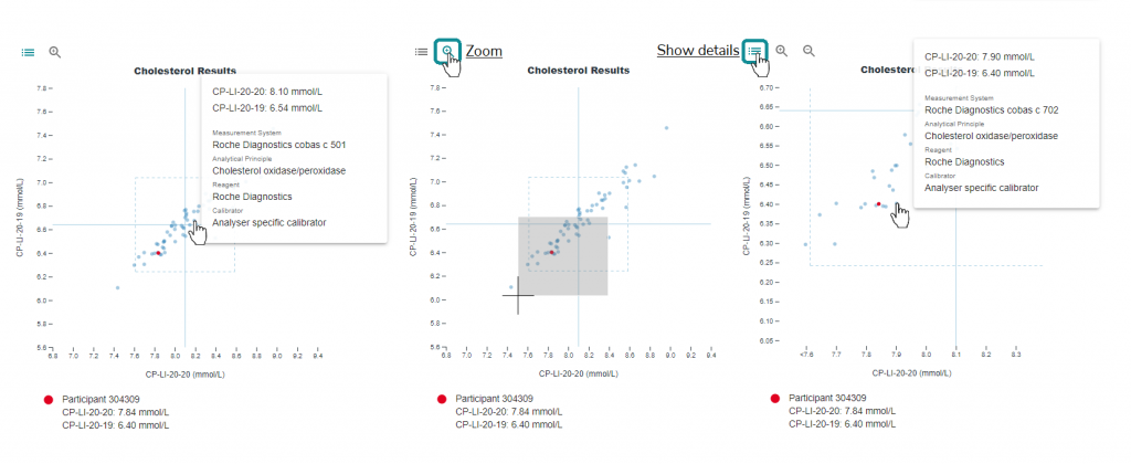
Viewing individual results
Hovering over results on the Youden plot will display the methods used and results returned by that lab. Where there are many returned results, this area can become quite crowded. To alleviate this, click the magnifying glass to bring up the zoom function, and then draw the location to focus on. Clicking the “Show details” button will bring back the hover function. Click the zoom out magnifying glass to return to the regular view.
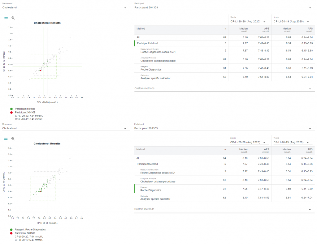
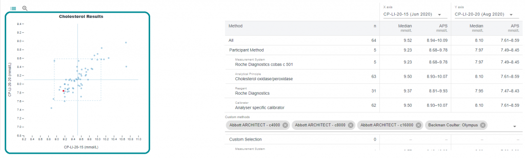
Method comparison
Selecting any option from the method list will outline those choices on the Youden plot. It will also adjust the APS box accordingly to reflect your selection.
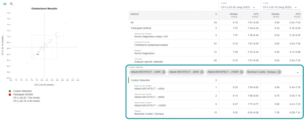
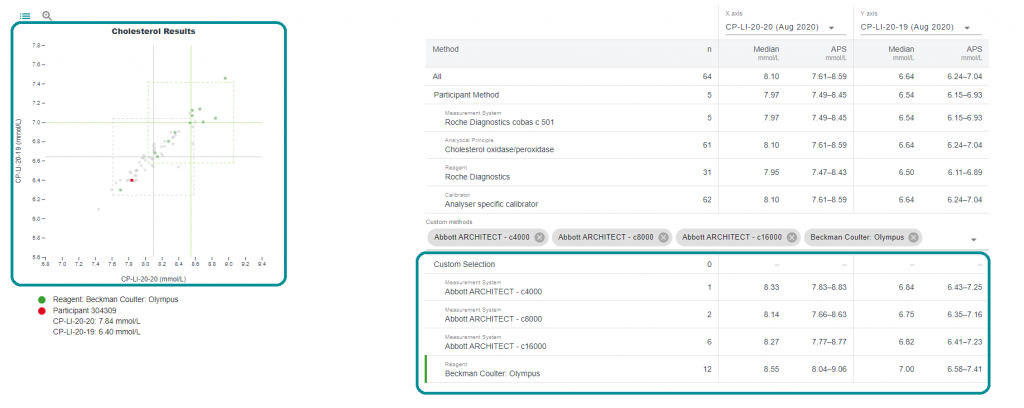
The method comparison capabilities go one step further, with the ability to select custom methods from the drop-down menu for a more in depth review of how other methods are performing. Choose the methods you wish to further analyse from this list.
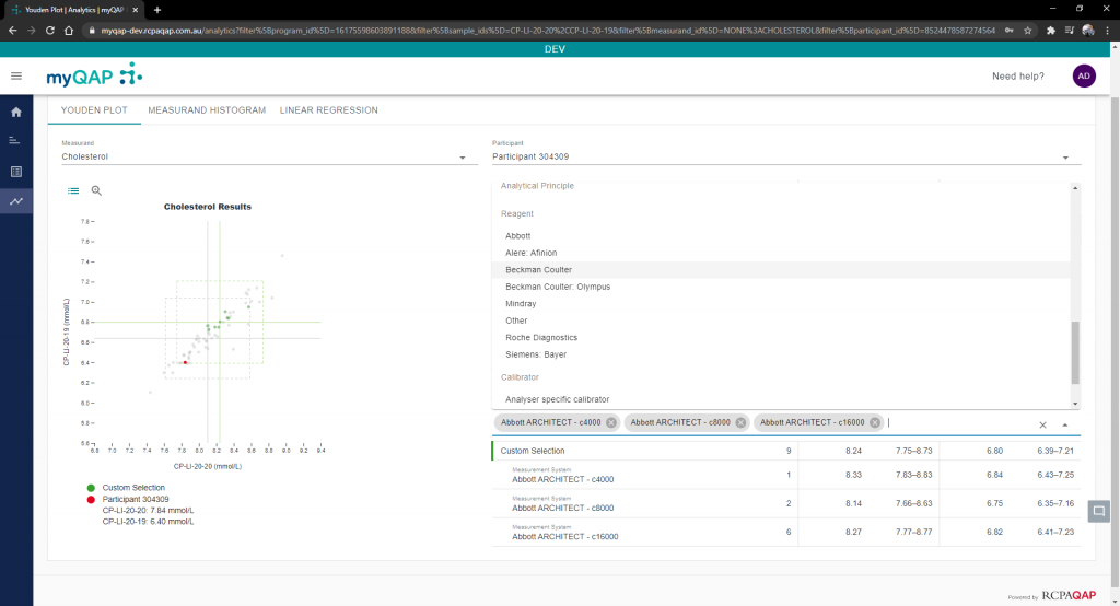
Note that if the combination you have selected has not been used/no results returned for that selection, no highlight will display on the Youden plot and you will have to select your selections individually from the supplied list.
Change sample selection
Using the two drop-down menus located above the Median and APS columns, adjusting the samples for comparison is a breeze. Simple click the list and choose your samples for each of the axes.
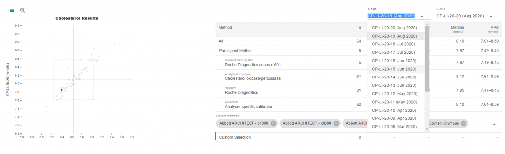
Notice the spread of results change on the Youden plot.
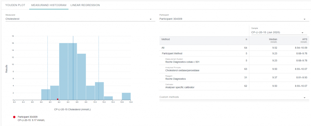
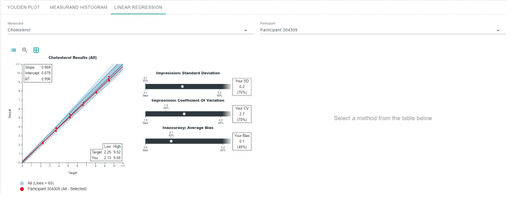
Use the Histogram and Linear Regression functions
Clicking either of the Histogram or Linear Regression tabs will move you to that part of the analytics functionality. Both of these work fairly similarly to the Youden plot section but there are separate help articles for these functions to further explain how to use them.
Can't find what you're looking for?
