Linear Regression
Analytics has been added into myQAP, allowing for in-depth and real-time comparison of results.
Select analytics from the side menu

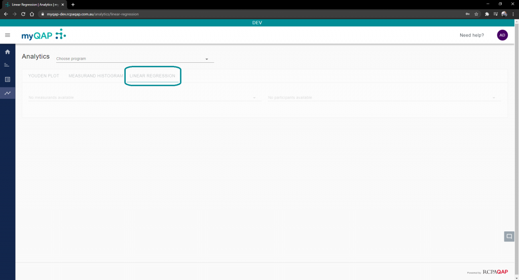
By default you will land on the Youden plot tab. Select the tab labelled, “Linear Regression”.
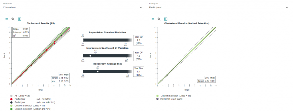
Select Program, Measurand, and Participant
Shown in the image below are the drop-down menus to select the program, measurand, and participant you wish to analyse further. All programs you are enrolled in* and all participants you are a contact for, will appear in these lists.
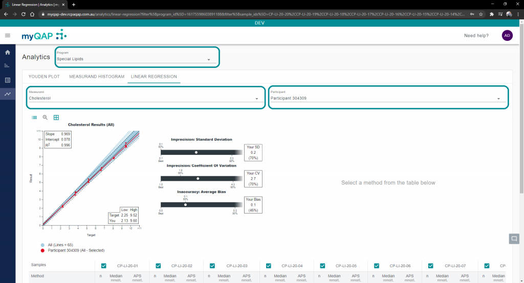
The linear regression chart will appear with up to date results from survey reports, as well as the precision and accuracy chart for the chosen samples. The red line and dots represent the selected participants results in relation the target source.
Hovering over lines will display more information about those results, including the method used and linear regression information of said method.

This chart can be quite populated in terms of results and may be hard to distinguish between them. Use the zoom function to get a closer look. Click the magnifying glass and draw a square over an area to zoom in. Clicking the show details button will bring back the hover function.
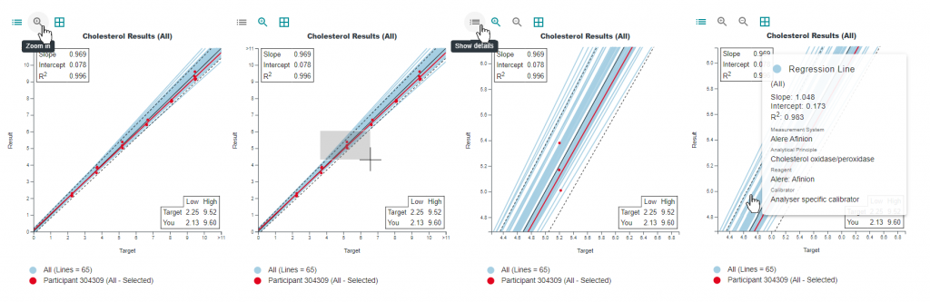
Click the zoom out magnifying glass to return to the full chart.
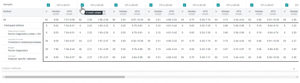
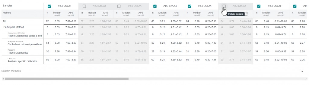
Sample selections
Scroll down the page to view a further breakdown of statistics in regard to the chosen participant’s method against each sample currently available. You can select and unselect any sample, which will adjust both the Linear Regression and Precision and Accuracy charts.
Method comparison
Selecting any category from the method table will display results of that selection on the “All” charts, as will as bringing up separate charts (“Method Selection” Linear Regression and Precision and Accuracy charts) that are only relevant to your selection.

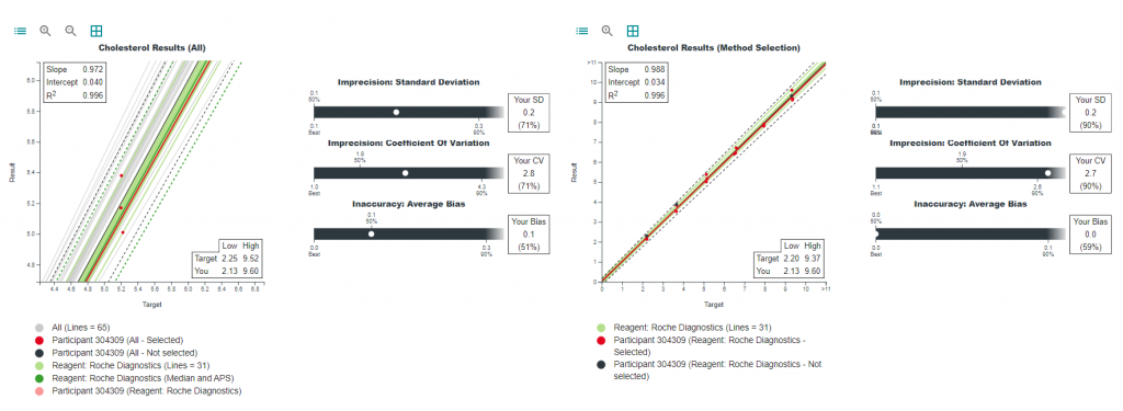
Looking at these charts, your selection will appear as a solid light green line, which represents all other users that chose this method selection. The dotted green lines represent the Median and APS of your selection, whilst the dotted black line represents the overall Median and APS.
Custom methods
Comparison against participants who are not in your peer group is also possible with the custom method selector. Click the drop-down menu and select the method categories you want to compare against.

Please note that if your custom selection has not been used by another user, the “Method Selection” chart (Right hand side chart) will not appear and you will have to either select each method individually, or change your selection to a combination that has been used by another participant.
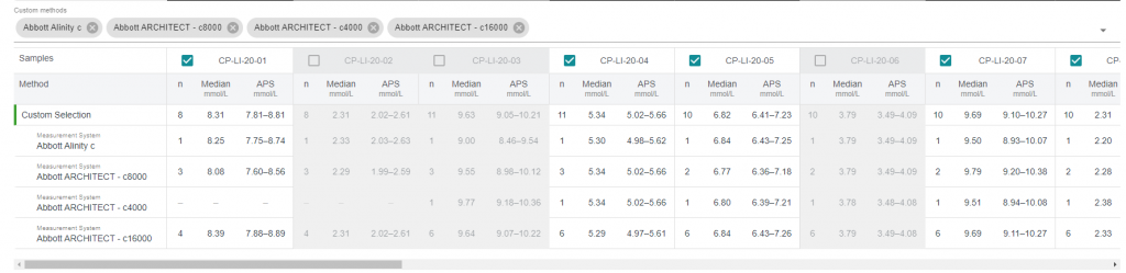
These choices will the reflect on the “Method Selection” chart, highlighted in green, with the APS and median lines adjusting accordingly with your selections.
Can't find what you're looking for?
